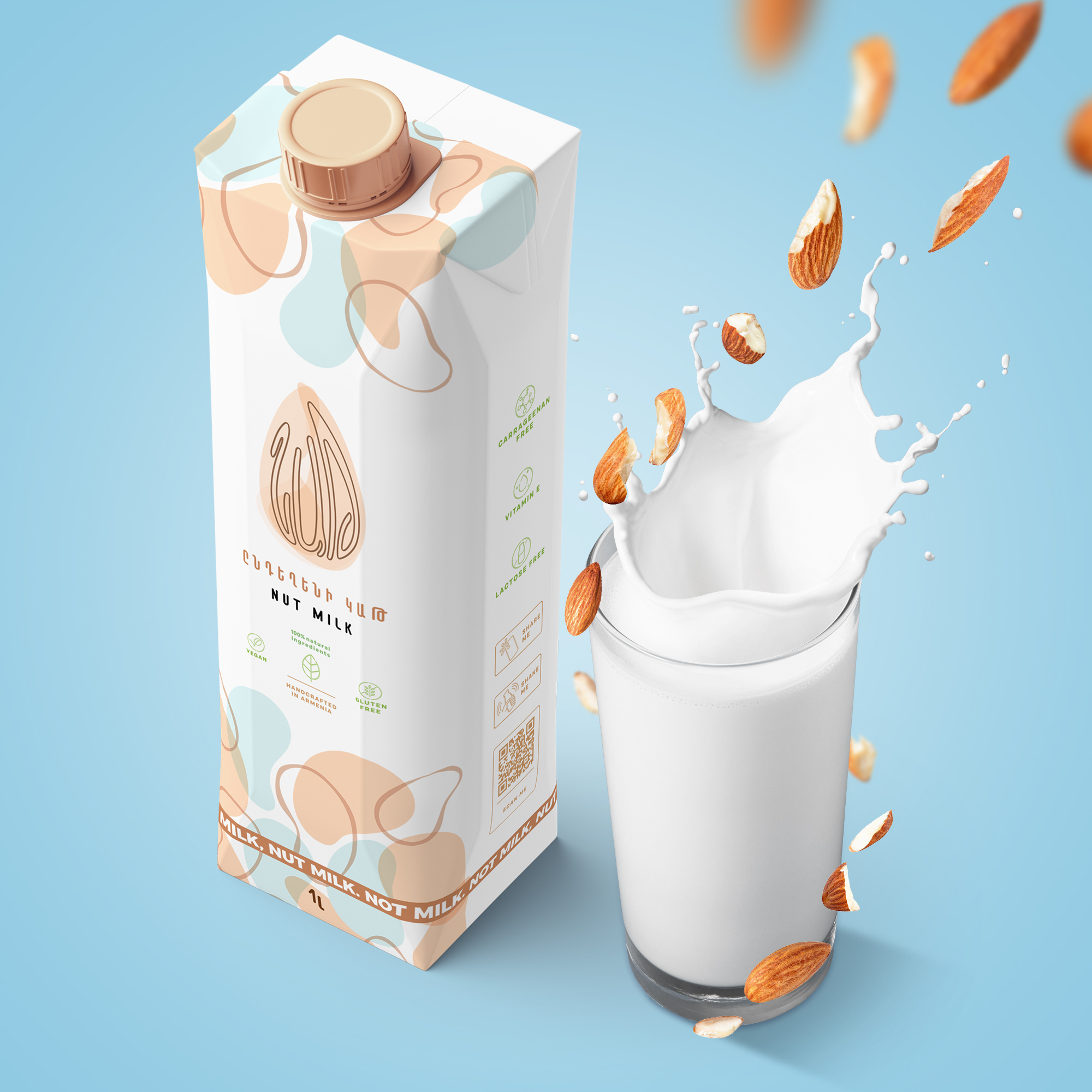
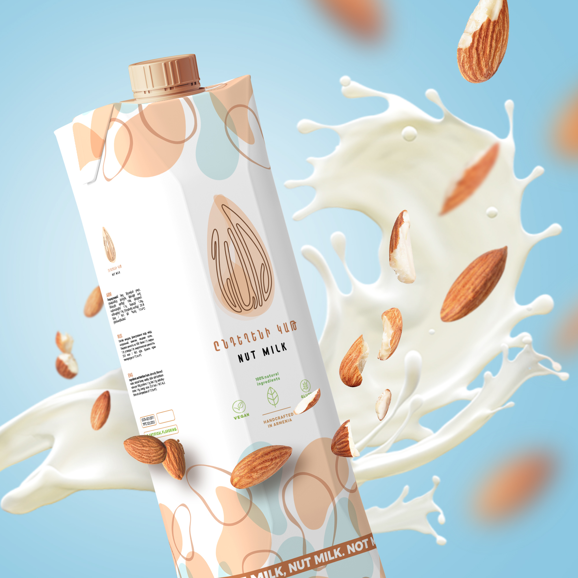


NAT milk
NAT is the first Armenian dairy alternative and plant-based brand with a mission to shift consumer behavior towards a healthier alternative. When creating the NAT brand, we set out to create a symbol that would make a simple almond milk brand unmistakingly identifiable as a healthy and nutritious alternative to dairy-based milk. The challenge was to create a brand that would become a part of our everyday vocabulary and be used as an equivalent to the word for milk in Armenian. Derived from the English word “nut”, the brand’s name hints at what the product is.
The hull, the shell, and the kernel are the 3 main parts of an almond. These components were visualized using 3 transparent shapes to form an almond. We found it fitting for the name to form the squiggly lines that are part of the texture of any almond. This creates an optical illusion – at first viewers see a regular almond, but look closer and find the name of the brand to bring almond milk to every household in Armenia.In English we changed the “u” in nut and in Armenian we changed the “կ” in “կաթ” (The Armenian word for milk) to ultimately give birth to the brand’s name – NAT. The concept for the visuals developed around the name as we tried to integrate the three letters in the icon for the logo. Eventually