Together | AI Technology App
Brand Case Study: Together App
Introduction
Together is an AI-driven platform designed to combat loneliness by fostering genuine connections through local events and activities. The app matches users based on their interests and profiles, enabling seamless transitions from online interactions to meaningful offline friendships. With the rapid growth of urban loneliness, especially among young professionals and transplants in cities like Austin, Together seeks to provide a solution that encourages community and friendship building.
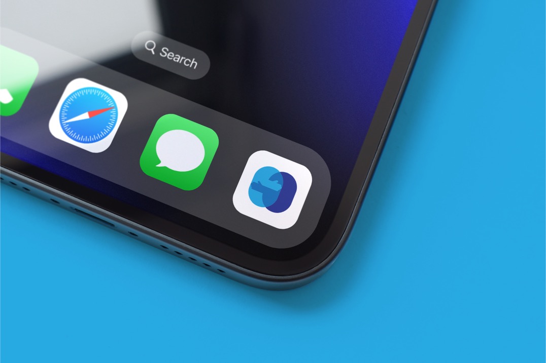
The logo design for Together, featuring two overlapping hands within a soft geometric shape, represents unity, connection, and human touch—reflecting the brand’s core mission to bring people closer together in the real world.
Challenges
The primary challenge for Together was creating a brand identity that would resonate with its target audience—people who feel isolated or disconnected in bustling urban environments. The visual identity needed to capture the essence of Together’s mission: to foster meaningful, real-world connections while maintaining a modern and approachable aesthetic. Additionally, the challenge was to ensure the brand would stand out in the crowded space of social apps while positioning itself as a solution that bridges online interaction and offline community building.
Solution
To address these challenges, the branding strategy for Together focused on simplicity, empathy, and inclusivity:
Logo and Visual Identity:
The logo, as depicted, was crafted to symbolize connection—two hands reaching out and overlapping. The use of calming blue hues reflects trust, serenity, and approachability. The geometric shape adds a modern touch while conveying harmony and balance, key aspects of what Together offers. The hands in the logo visually express the act of reaching out and coming together, reinforcing the app’s mission of creating meaningful relationships.Brand Voice:
Together’s messaging is warm, supportive, and inclusive. The tone is one of empowerment—encouraging users to step out of their comfort zone to build real-world connections that matter.Visual Consistency:
The color palette and clean, rounded typography work cohesively to give the brand a sense of unity and togetherness. The minimalistic approach emphasizes the app’s simple goal—bringing people together—without overwhelming the user with unnecessary complexity.
Impact
The branding for Together has successfully positioned the app as a meaningful and approachable solution to loneliness. The logo, with its subtle symbolism of human connection, has been well received, especially in the app’s test market, Austin, Texas, where urban loneliness is prevalent. Early adopters are resonating with the app’s mission and the visually soothing, modern identity. Together’s branding highlights the app’s value in creating friendships, encouraging user trust and adoption.
The strategic use of warm, inviting tones and the logo’s symbolism have differentiated Together from typical social apps, aligning it more with well-being and community-building initiatives. The brand’s message of fostering real-world connections is clear and impactful, setting the foundation for future growth as the app expands into new markets.