


FreedX Cryptocurrency Exchange Branding
The name “Freed” for a cryptocurrency exchange platform holds profound significance, drawing inspiration from the ideas and principles championed by Friedrich Hayek, a prominent economist and philosopher whose critiques of centralized economies resonate deeply with the ethos of cryptocurrencies. We simplified the name Fried-rich and simply shortened it to Freed.
Hayek was a staunch advocate for free markets, individual liberty, and the denationalization of money. His seminal works, such as “The Road to Serfdom” and “The Constitution of Liberty,” articulated the dangers of centralized planning and the importance of decentralized economic systems. By naming the cryptocurrency exchange “FreedX,” we pay homage to Hayek’s vision of a decentralized economy, free from the constraints of government intervention and control.
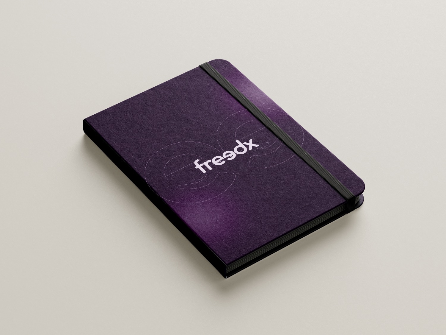
The “FreedX” logo elegantly intertwines Friedrich Hayek’s concept of the “invisible hand” with a sophisticated negative space design. This thoughtful approach is artfully expressed within the typography of the logo, particularly through the use of the letter “e”.
In this design, the two “e”s subtly incorporate the imagery of hands within the negative space, paying homage to Hayek’s idea of the invisible hand guiding the market. This subtle reference connects the brand to Hayek’s economic theories without being overtly explicit, inviting users to interpret the concept themselves.
Upon closer examination, the negative space between the two “e”s reveals the shape of a bull. This clever integration symbolizes a bullish market, aligning with the company’s vision and aspirations as a forward-thinking exchange. The typeface is modern and clean, reinforcing the brand’s commitment to innovation and dynamic market engagement.
Overall, the “FreedX” logo is a masterful blend of economic philosophy and visual ingenuity, conveying the brand’s ethos and market orientation through a refined and intelligent design.
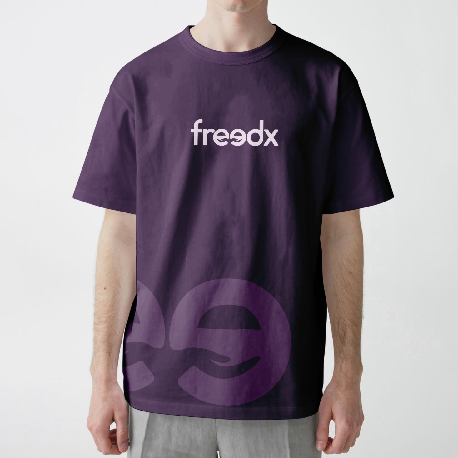
The FreedX logotype is a stylish serif with rounded corners, incorporating hand imagery within the negative space of the double ‘e’s that references the concept of The Invisible Hand by Friedrich Hayek.