Brand Case Study: Pearl Dental Clinic
Overview
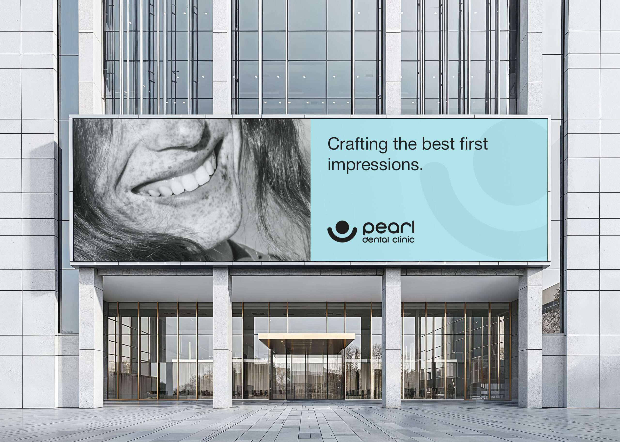
Pearl Dental Clinic sought a brand identity that would visually communicate its core values—excellence, care, and trust—while maintaining a unique and meaningful connection to its name. The goal was to create a logo that felt modern, inviting, and culturally significant.
Concept & Design Approach
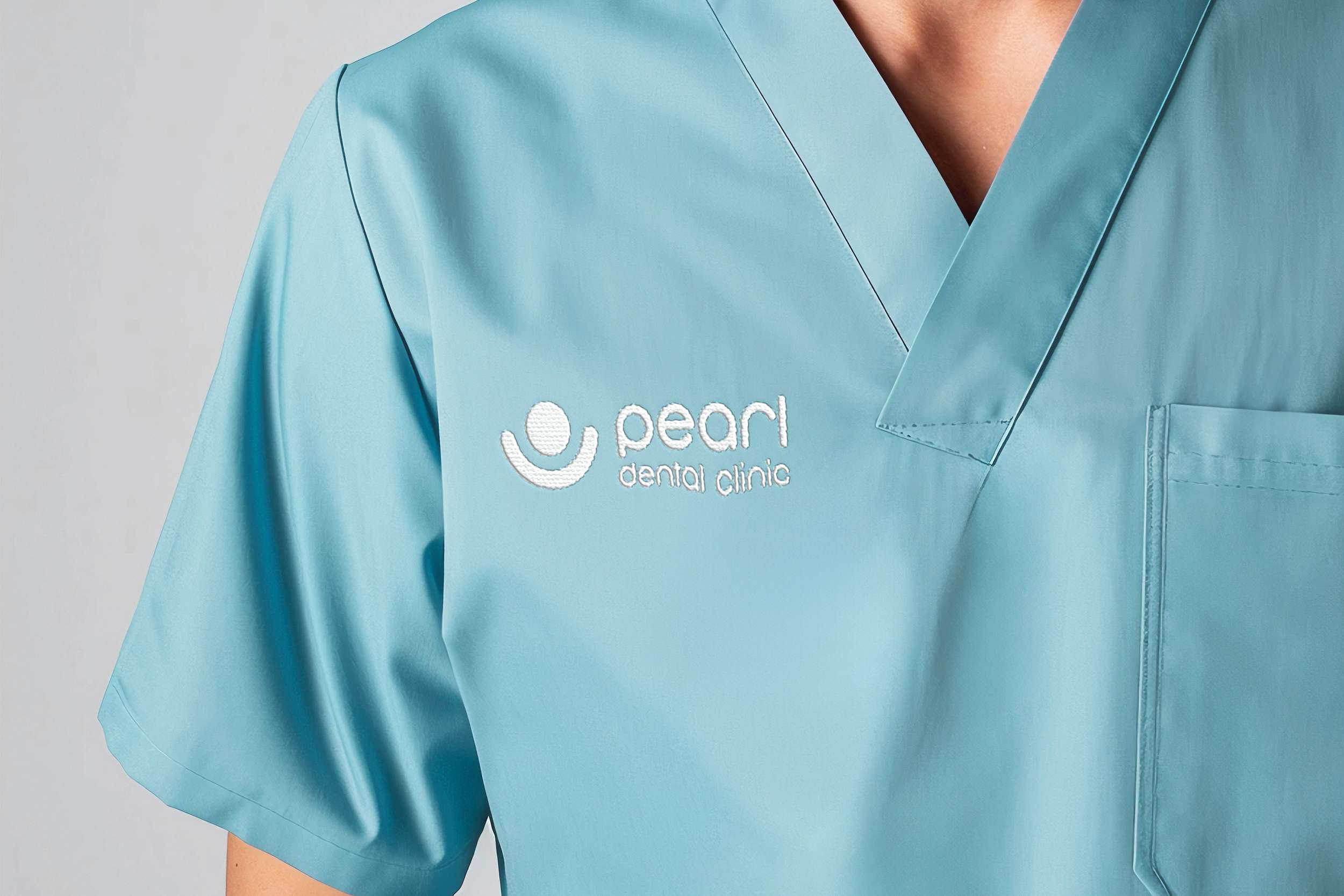
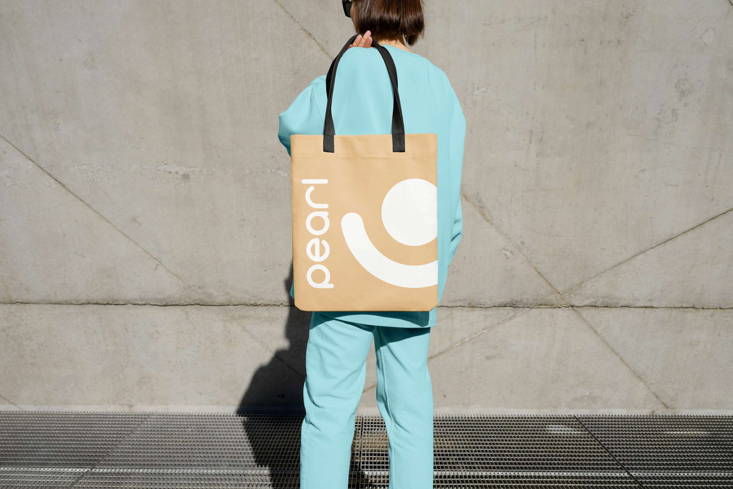
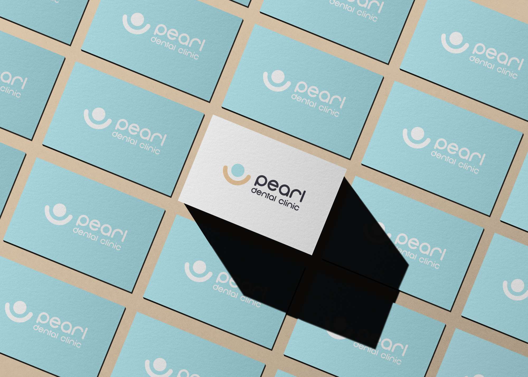
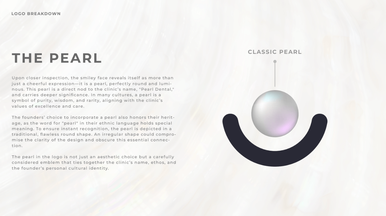
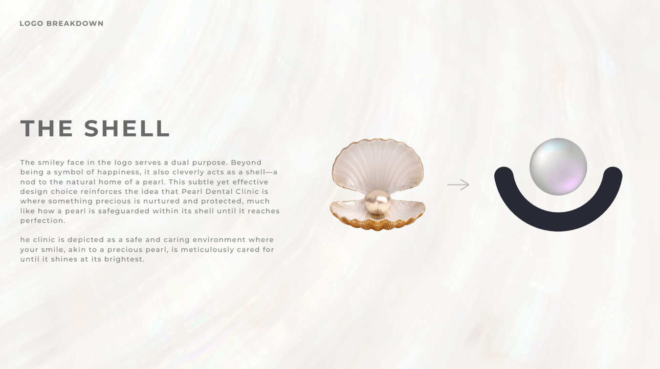
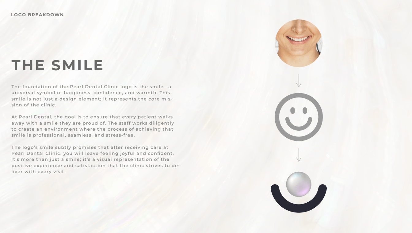
The final logo is a seamless blend of symbolism and simplicity. At first glance, it presents a smiley face, evoking warmth and friendliness. Upon closer inspection, this smile transforms into a pearl—perfectly round and luminous.
- Connection to the Name – The pearl directly ties to “Pearl Dental,” reinforcing brand recognition in a subtle yet powerful way.
- Symbolism of a Pearl – Across cultures, pearls represent purity, wisdom, and rarity—qualities that align with the clinic’s high standard of care.
- Cultural Significance – The word “pearl” holds deep meaning in the founders’ native language, making the design a personal reflection of identity.
- Flawless Round Shape – The pearl’s perfect form ensures clarity and maintains the integrity of the visual identity. An irregular shape could weaken its intended meaning.
- Dual-Purpose Smiley – Beyond conveying happiness and approachability, the smiley face subtly represents a shell, emphasizing protection, care, and the nurturing environment the clinic provides for patients.
Impact
The Pearl Dental Clinic branding successfully merges aesthetics with storytelling, creating a visual identity that is both inviting and deeply meaningful. The thoughtful integration of the pearl enhances brand recognition, cultural resonance, and emotional connection with patients.
By balancing simplicity with depth, the Pearl Dental Clinic logo stands as a refined, timeless emblem that reflects the clinic’s philosophy of care and excellence.