Milko’s Rebranding & Packaging
In developing the brand identity for “Milkos,” we recognized the importance of creating a strong, conceptual foundation to shape its narrative and visual presence. While the original name, “Milko,” lacked a clear brand story or philosophical underpinning, we took the opportunity to craft a cohesive and compelling identity that would resonate with its Mediterranean roots. This approach, although not ideal, aligns with many market case studies that emphasize storytelling and identity as prerequisites for successful brand development or rebranding.
The creative brief specifically highlighted the Mediterranean as a core descriptor of the brand, which naturally led us to position the brand within this culinary tradition. Given that many of the products are central to Mediterranean cuisine, we proposed renaming the brand to “Milkos”—a subtle evolution from the current name that allows for continuity while adding depth. The name pays homage to a fictional but legendary Mediterranean cheesemaker, Mr. Milkos, who mastered the art of blending recipes and traditions from various Mediterranean subcultures. This new narrative forms the basis for storytelling and imbues the brand with a distinctive identity that resonates with its offerings.
Key Advantages of the Mediterranean Brand Pillar:
- Minimal Disruption to Existing Customers: By keeping a similar name, the transition is seamless, minimizing any risk of losing loyal customers.
- Distinct Identity: The new name, story, and Mediterranean association give the brand a clear and specific identity that can be communicated across touchpoints.
- Narrative Foundation: The story of Mr. Milkos serves as a foundation for the brand’s promise, helping to connect with customers on an emotional level.
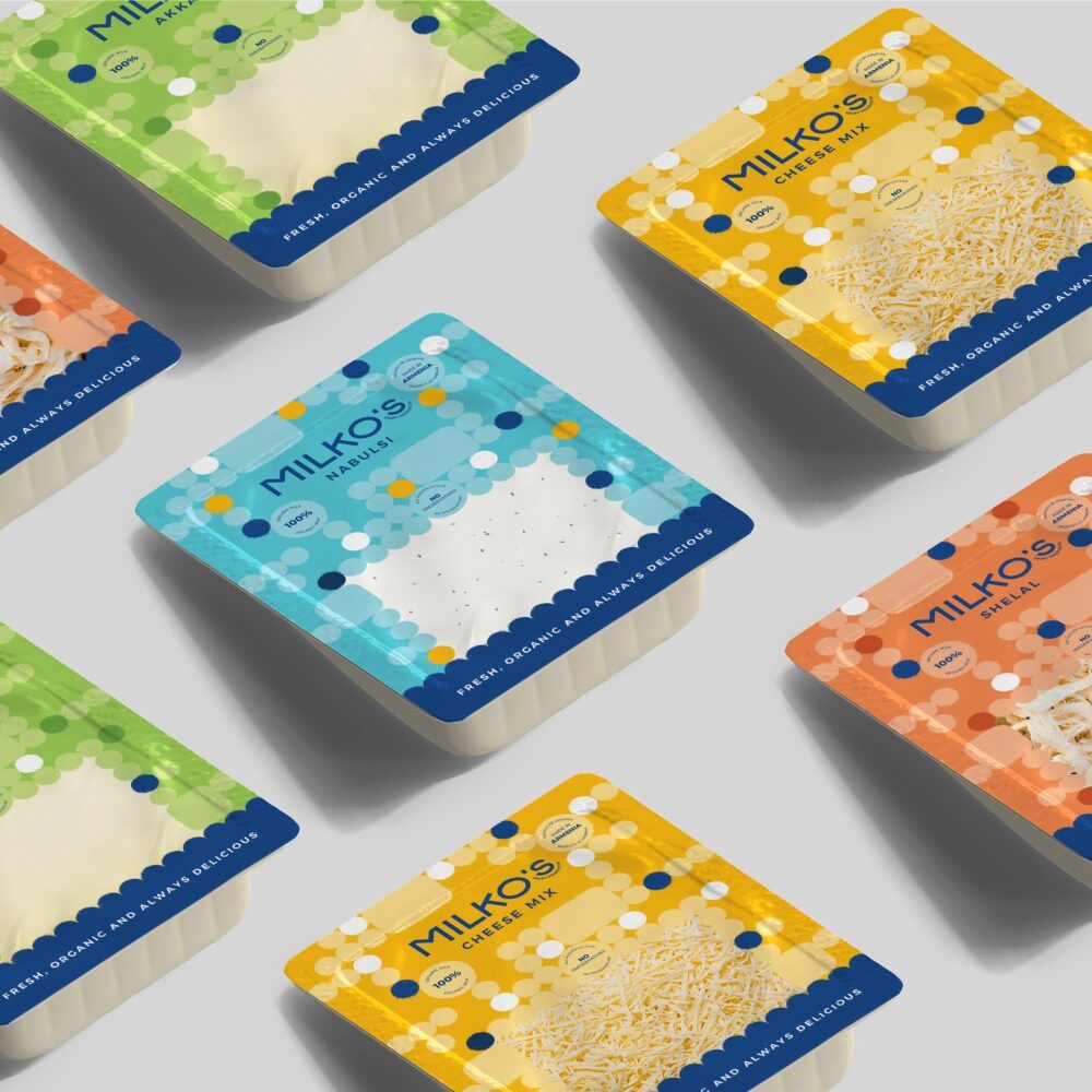
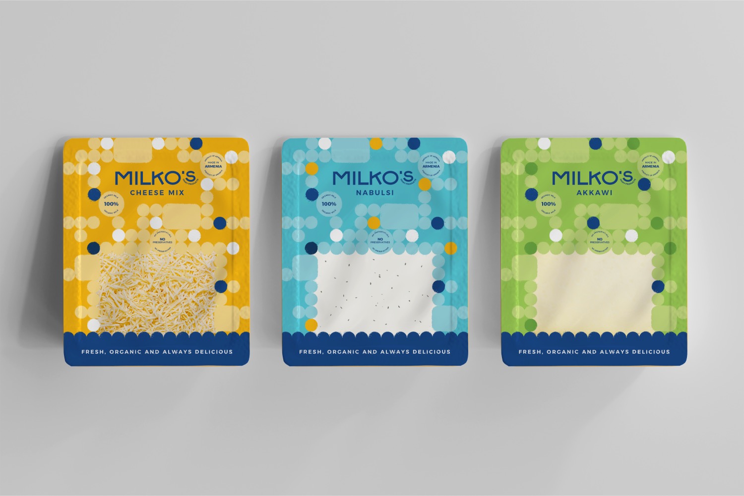
- Visual Direction: The Mediterranean theme naturally guides the visual rebrand, from typography to color palettes.
- Culinary Popularity: Mediterranean cuisine is widely celebrated for its taste and health benefits, particularly in Yerevan, making it a fitting and marketable association for the brand.
Logo Concept and Visual Identity
For the logo and visual elements, we drew inspiration from the Mediterranean’s rich cultural history, while modernizing it to fit contemporary branding trends. The typography can take one of two forms:
- Signature-Inspired Cursive: A cursive typeface mimicking the signature of Mr. Milkos, evoking authenticity, tradition, and craftsmanship.
- Modern Mediterranean Vibe: Alternatively, a clean and modern typeface that reflects the aesthetic of Mediterranean culture but is tailored for a contemporary brand.
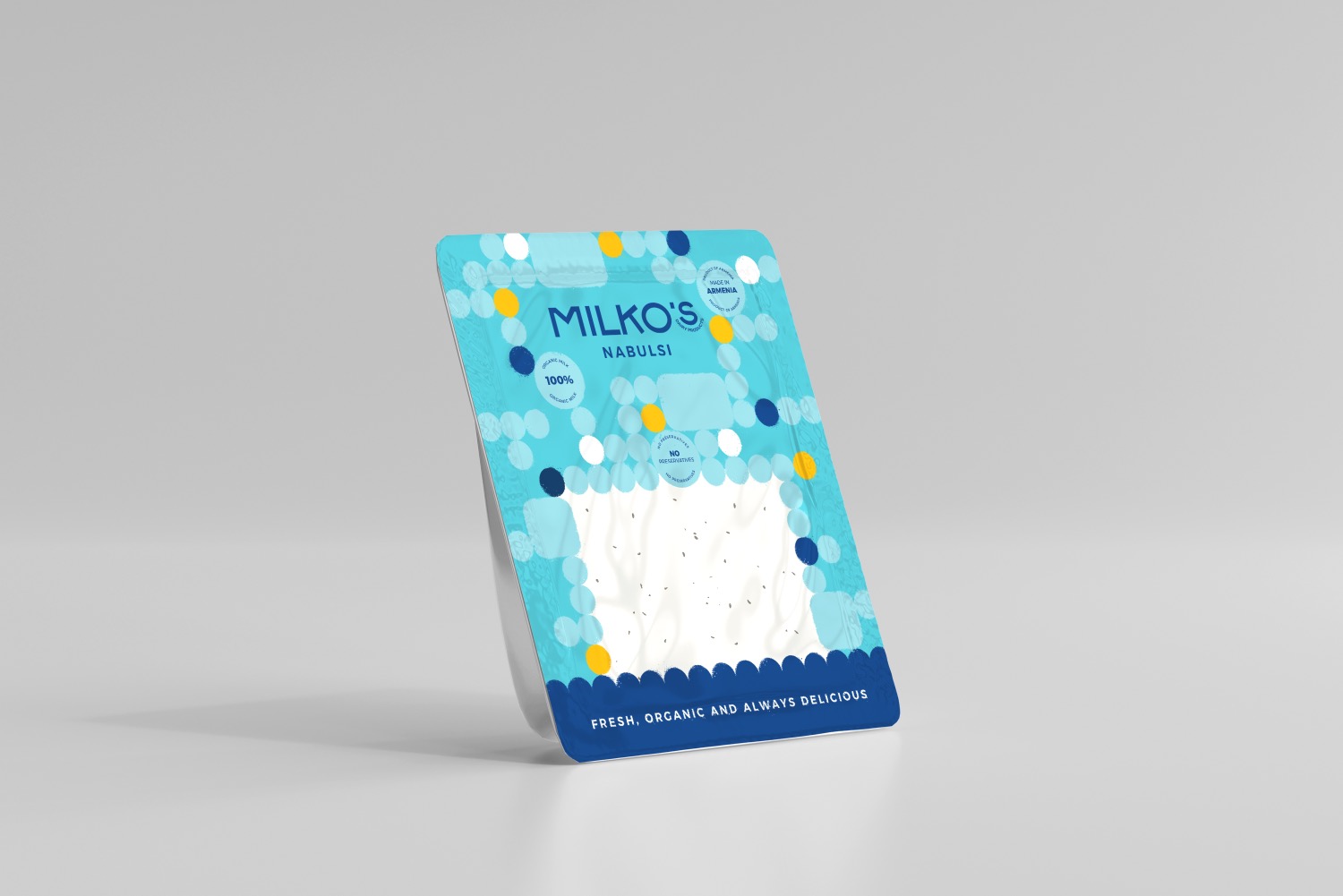
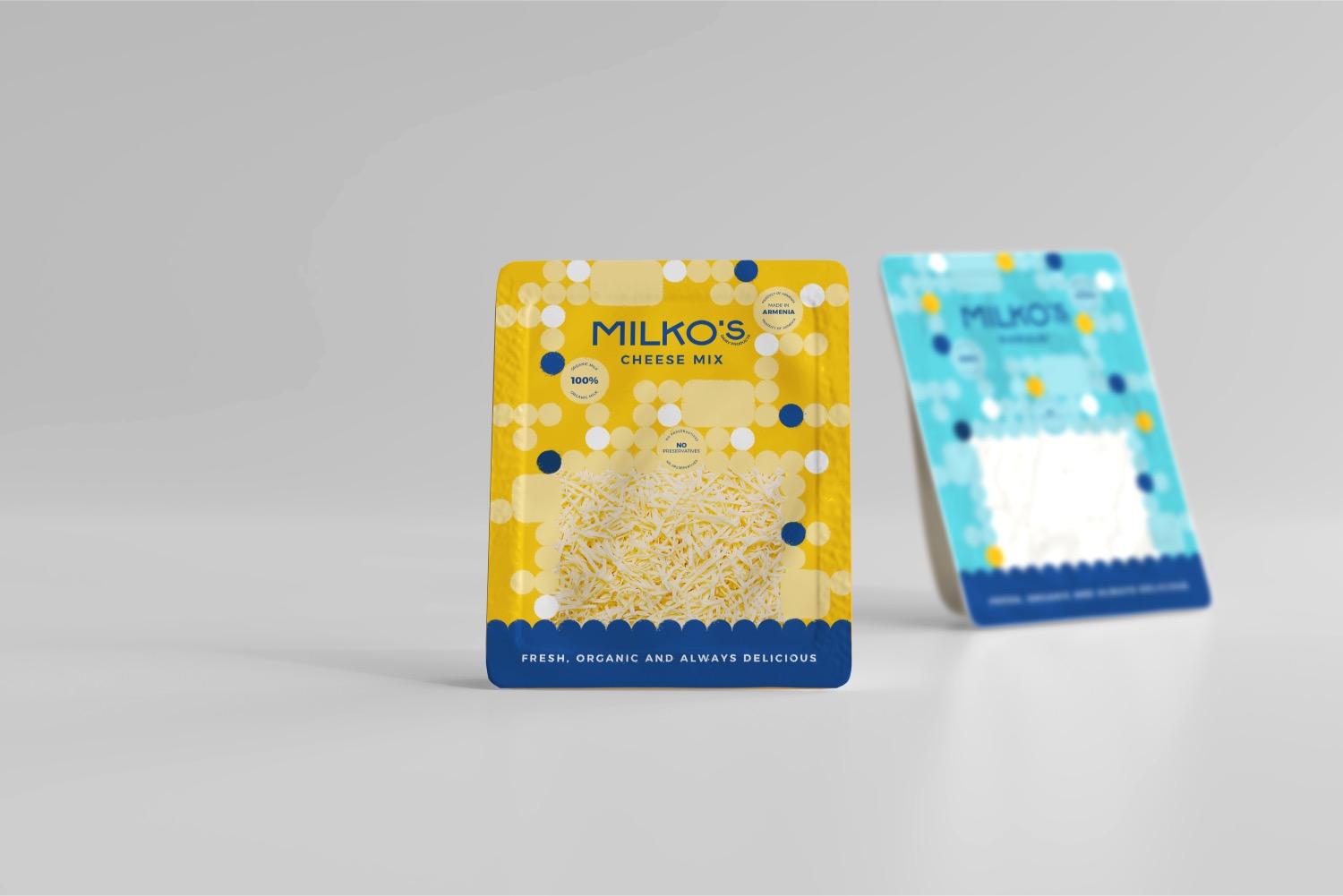
The color palette also draws from Mediterranean influences, featuring hues reminiscent of the sea, sun, and natural elements, further reinforcing the brand’s connection to its roots. The overall branding process has been crafted to give Milkos a unique identity, grounded in the Mediterranean tradition, while also offering flexibility for modern adaptations.


